Min vegg
University project (MA-level) – 10 weeks, individual project – 2024
Brief (short): How might we make the weather forecast (Yr) more relevant, understandable, personal and engaging for each individual user?
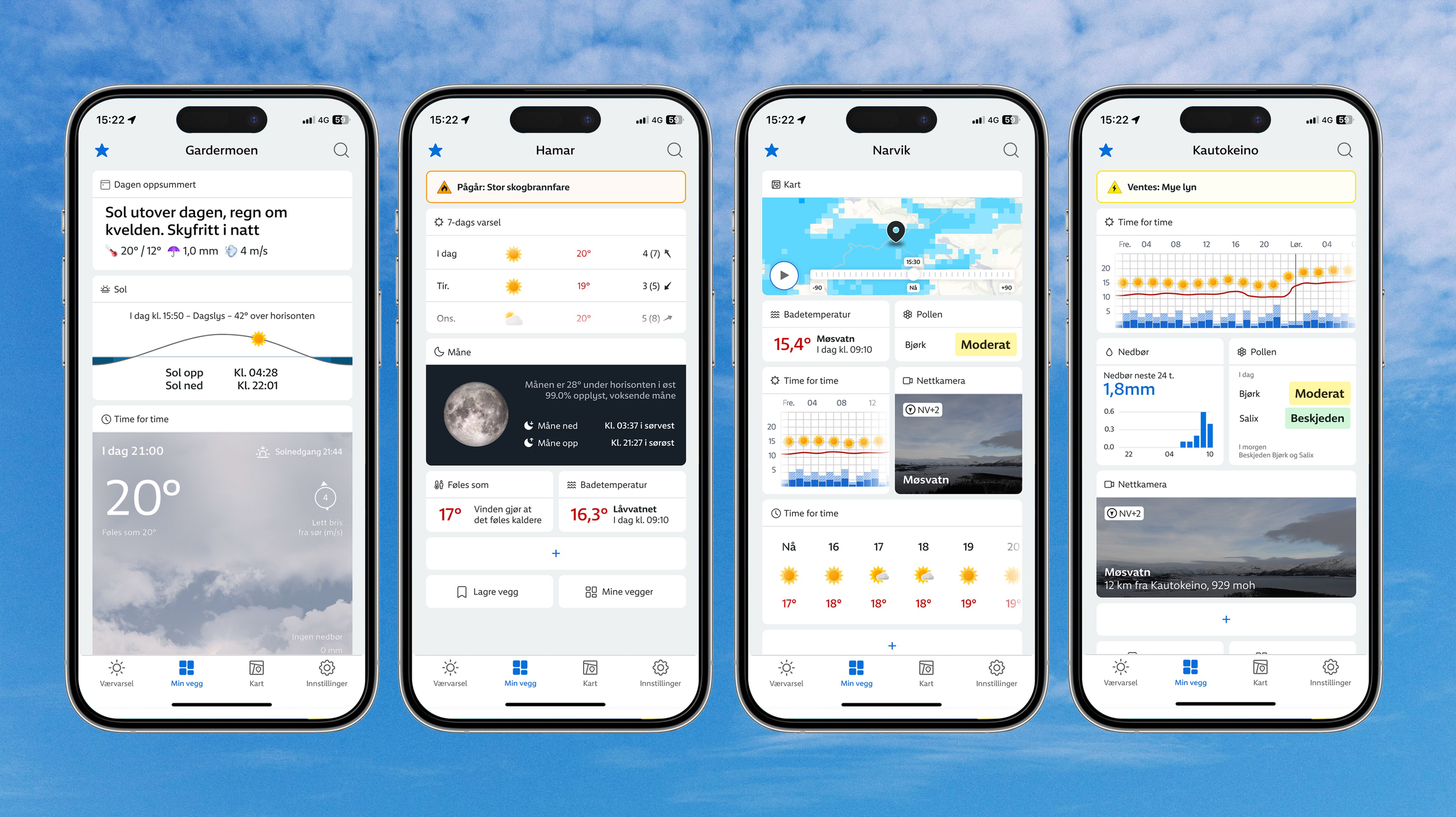
"Min vegg" is a concept developed in response to a brief from Yr, Norway’s leading weather forecast service. The brief sought ways to enhance personalization within the app. My solution is a flexible dashboard that allows users to personalise their weather forecasts according to their preferences and priorities, while also highlighting overlooked information within the app.
Concept overview and onboarding example.
Critical areas:
What part of the service can benefit from personalisation?
A part of the brief was focused on what specific part of the Yr app might benefit from personalisation and customisation. My research showed that most of Yr’s users are fond of their “regular” forecast. However, Yr has a different tab called “other conditions”. This tab contains more obscure data such as bathing temperatures, UV index and an aurora borealis forecast. The users I spoke with didn’t know or hadn’t explored this tab much but often became very intrigued when I told them about it. It was, however, often mentioned that the tab felt cluttered and that although there was a lot of interesting information, there was also a lot they didn’t care about. Therefore, I decided to redesign this tab, with a focus on personalisation, to shine a light on all of this interesting and useful data.
Onboarding
It became clear through interviews and user testing that there was a big gap in users’ motivation to spend time on personalisation. Some mentioned they would want to personalise their forecast if it was easy and quick to set up. Based on this, I spent a lot of time testing and designing different concepts for onboarding. I found that the users would often become most excited when they could customise and play around with the dashboard instead of only being shown the possibilities. Because of this, I decided that a dynamic onboarding that is unique to each user was the best option. This would be based on the individual user’s behaviour when first interacting with the concept.
The dashboard is based on the “Jakob’s Law” principle which states that users prefer an app to work the same way as all the other apps they already know. Therefore, most digitally competent users will understand how the dashboard works immediately and will not require any onboarding. They will be given time to explore the dashboard, letting them experiment in their own time. Users who are not as used to similar solutions, however, will be guided through the dashboard with tooltips.
The diagram below aims to explain the different paths users will take during their personalised onboarding:

Starting configuration
I wanted the users to be instantly interested and open to exploring the dashboard. It was therefore important to develop a start configuration that piques the user’s interest while showing the range of possibilities available. It was also important to remember that the dashboard is based on data that is often overlooked or new to most users.
The start configuration was developed through user testing with the help of a paper prototype. This enabled the testers to play around with the configuration and take time to look through all of the possibilities. This gave me good insight into what widgets are most popular, as well as how users think when setting up their personalised dashboard.


Reflection
Looking back at the project, I think some parts would be very interesting to explore further:
Spending time designing clever micro-animations to have a smoother and more seamless onboarding process could be beneficial to the concept as a whole. This could guide the user without the use of tooltips and unnecessary hindering of a user’s natural exploration. Researching and developing a more exact framework for how the dynamic onboarding would work would also be great.
Because I enjoy working visually, I would also love to spend a lot more time developing widgets. Looking at how to explain data visually understandably and beautifully in different-sized widgets could be a 10-week project in its own right.